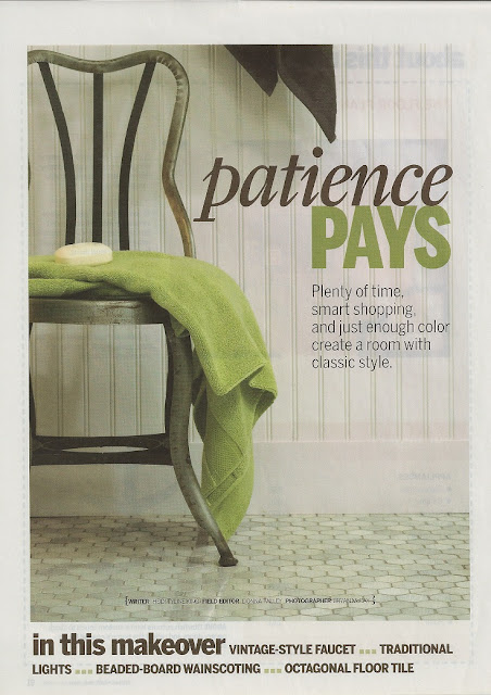
 Two years ago my husband and I finished our basement to include a bedroom, bathroom and common area. The photo shoots were done about a year ago and have recently appeared on news stands. The common area was featured in Better Homes and Gardens July 2009 edition and now the bathroom can be seen in BH&G's current issue of Bed and Bath Makeovers.
 Kitchen and Bath Makeovers / Photographer - Bryan McCay
Stylist - Donna Talley, Regional Editor and producer for Meredith Publications
Kitchen and Bath MakeOvers / Photographer - Bryan McCay
Stylist - Donna Talley, Regional Editor and Producer for Meredith Publications
We wanted to create a bright environment as there is no natural light in this space.
We had to make several compromises because of costs including using a shower insert instead of tile and forgoing glass shower doors. To get the desired look, we used white sub-way tiles from the top of the shower insert to the ceiling, on the ceiling above the shower and on the area above the wainscotting in the front of the shower. We over calculated how much tile we needed and ended up using the left over tile as the backsplash behind the bar area. A happy mistake!
Kitchen and Bath Makeovers / Photographer - Bryan McCay
Stylist - Donna Talley, Regional Editor and Producer for Meredith Publications
Not being able to afford shower doors turned out to be a good thing as well. It gave me the opportunity to make the shower curtain which I really think makes the space special. Because this is a guest bathroom and not used on a regular basis not having doors really isn't an issue.
Kitchen and Bath Makeovers / Photograper - Bryan McCay
Styllist - Donna Talley, Regional Editor and Producer forMeredith Publications
I am very pleased with how the entire basement project turned out - bedroom, bathroom and common area. People who have visited have commented on how nice it is to stay and have asked to stay longer the next time. This makes all the planning and work worth while.


9 comments:
That's wonderful! You must feel wonderful to have your home and work featured in these magazines. I'll have to pick up this issue as I'd love to see the whole thing. I love the green I'm seeing, too. That shower curtain is fantastic ~ love the fabric!
love your bath...especially that shower cutain!
How beautiful!!! Your blog is lovely!!!
I popped over from Kathy's and I am so glad I did!!! I will be returning again and again to check out your wonderful site!!!
If you get a minute...stop by my blog...I am having a giveaway that you might enjoy!!!
Have a wonderful Monday!!!
XOXO
Cathy
How exciting to have your home in a magazine ! I really love the shower curtain.
Congratulations, it's beautiful what you did and what lovely photos!
Gorgeous! How exciting to be featured!
How fun to be published. And I just love the bathroom. It looks great!
oh beautiful!!! i love the shower curtain too & it just makes the space!! love the feeling & I see why it was published! congratulations!!!
Congratulations! It turned out so beautiful. An inspiration, I need to work on my own bathroom. xo Lidy
Post a Comment