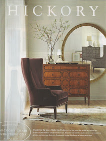
Recently, however, I came across this ad by Hickory Chair and was captivated by the asymmetrical placement of a single large mirror.
It reminded me of another favorite photo – this one by designer Lauren Liess of Pure Style Home – featuring a large piece of art placed slightly off-center.
Pure Style Home
The asymmetrical arrangement in these two photos really has me thinking about how I approach design. Perhaps two is not always better than one?
I would love to know what you think. Do you decorate in symmetrical pairs or do you prefer a more asymmetrical look with a single large focal point like the photos above?


I think that in those pictures despite having asymmetrical designs, they do have balance. But somehow they still make me feel uneasy. I'm not sure what it is that makes me feel that way, but I do think they have designed those spaces well. I think it's just not for me though. =)
ReplyDeleteGreat photos and interesting. I am actually a little of both. I really do love pairs though, so maybe that is first thought. Hugs, Marty
ReplyDeleteI like both and I think it is about balancing it out with High/ lows if you don't use a pair of something!
ReplyDeletexoxo
Karena
Art by Karena
Exciting New $150 Giveaway from Dr Perricone! Artful Beauty from the inside and out! Come and Enter!
I do both, Stacy. In a more formal room like my dining room, I go the symmetrical route. In a more casual room, like our den I do asymmetrical.
ReplyDeleteLove these photos and ideas. Lauren does very interesting things, I love her!
ReplyDeleteI do both, depending on the room.
Yes, Lauren is a smart woman! The Hickory photo is a bit much for me, though. I think that they were attempting to get the viewer's attention as much as make a design statement.
ReplyDeleteThank you for sharing...I love both of the photos you show, so unexpected! Love it.
ReplyDelete~Pam
pamspaintparlor.typepad.com
Interesting how the Hickory photo grabs you with the Asymmetry of the arrangement...
ReplyDeleteYet, the reflection in the mirror indicates... a twin dresser and chair!
The next photo the same thing!
The room positioning is asymmetrical but the subject matter in the artwork...Symmetrical!
I think that helps me to accept it even more!...LOL!
Pat
I agree with what Corn in my Coffee-Pot said. But also, if you take away the tall flower arrangement in the first picture and the lamp in the second picture, you would not have balance. It is just important to have positive space as it is to have negative space. Thanks for bringing up this discussion!
ReplyDeleteanother gorgeous blog!!! thank you for sharing such beauty with us :)
ReplyDelete