Thursday, July 28, 2011

Are Two Better than One?

When it comes to decorating I tend to favor pairs of items in symmetrical arrangements– two lamps on my buffet, two potted plants on the mantel, pairs of pillows on my sofa, pairs of candle sticks on my dining room table, and matching footstools tucked under a console table.   I could go on and on but you get the point.

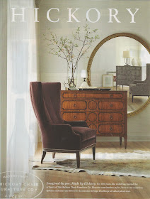
Recently, however, I came across this ad by Hickory Chair and was captivated by the asymmetrical placement of a single large mirror.


It reminded me of another favorite photo – this one by designer Lauren Liess of Pure Style Home – featuring a large piece of art placed slightly off-center.

Pure Style Home

The asymmetrical arrangement in these two photos really has me thinking about how I approach design.  Perhaps two is not always better than one?

I would love to know what you think.  Do you decorate in symmetrical pairs or do you prefer a more asymmetrical look with a single large focal point like the photos above?


Saturday, July 23, 2011

Balloon Sandals

Yes, the following post is a bit out of the ordinary for RDH – no home ideas here - but this project is so cute and simple I just had to share!


While on vacation, I spied a friend of my mother wearing a pair of sandals she had created using water balloons and inexpensive flip flops.  My daughter immediately wanted a pair so off to the Dollar Store (balloons) and CVS (sandals) we went.

As you can see from the picture above, the sandals we purchased had beads along the straps, so the first step was to remove them.  Once the beads were cut-off, we simply tied the balloons – one at a time – around the straps until they were completely covered.


Helpful tips:
- The balloons work better if they are stretched slightly before tying.
- Once you tie the balloon on the strap pull it tight so the balloons appear fluffy.
- Alternate directions of the balloons as you tie so that you don’t end up with all tops on one side and ends on the other.
- Push the balloons close together as you work so that they are nice and tight.
- Although this is a simple project, younger kids might have a hard time tying and pulling the balloons tight.

Hope you enjoyed this simple project.  My daughter has been wearing these sandals non-stop and lots of people have asked her where she bought them!

Wednesday, July 20, 2011

Do you know these chairs?

Right before I left on vacation I received an email from a reader asking me about the pair of vintage orange chairs I had purchased for my dining room.  He had recently found a similar pair at an estate sale and wanted to know if I had any additional information about them.


Unfortunately, other than the fact they are from the 1950’s (at least that was what I was told), I know little about these chairs.  I tried doing some internet research but came up empty handed.

via Jan Showers
I have come across additional pictures of similar chairs but no information about when they were made, who made them or even what they are called.
via Design Indulgence
If you know anything about these types of chairs and are willing to share your knowledge please let me know.  I would be so grateful and I know others would be as well.  Thanks so much!

Sunday, July 17, 2011

Where I have been

For nearly the past three weeks I have been here . . .

the beach in North Carolina

here . . .

South Carolina

here . . .

Washington DC

and many more places in between enjoying some fun family vacation time.

Needless to say, posts have been few and far between and I am more than a little bit behind on all things “bloggy.”  I hope to be up to speed again soon! 

Sunday, July 10, 2011

More Marble – Kitchen Corner Redo Completed!


As far back as I can remember, I have always been smitten with marble. I love its classic look and am particularly fond of pieces which are white with grey veining. Since redoing countertops in my house is out of the question, I have slowly added marble to my decor in a few simpler and smaller ways.

For example, not too long ago I purchased the quirky marble top table (shown below) for my den.


I updated an inexpensive table in my daughter’s bedroom by pairing it with a cast-off marble top I found at a local antique store.


When we finished our basement bathroom, we choose hexagon shaped marble tiles for the floor.

Real-Life Kitchen and Baths / Photographer - Bryan McCay
Stylist - Donna Talley, Regional Editor and Producer for Meredith Publications

My latest marble addition comes in the form of a custom cut slab for the vintage grain bin in my kitchen eating area.

After the mirror received a chalk paint makeover, I decided to finish the redesign of this little corner by topping the grain bin with marble.


I had a local granite dealer cut a piece of Carrera marble slightly larger than the size of the cabinet top. It was finished on three sides with a simple edge and then placed directly on the cabinet – no glue required. Although I would not consider this an inexpensive project, I was able to save money by waiting for a remnant (left over piece) to become available and by transporting the marble myself.

Below is how this area looked before.


This is how it looks today.


I have to say I love it! The marble lightens up the space, adds a new texture to the kitchen and tones down all the wood in this area.

So is this the end of the marble in my house? Probably not as I can’t see my love of marble ending any time soon!

Friday, July 1, 2011

July Blog of the Month – Emily A. Clark

Today I am thrilled to be featuring Emily A. Clark as the July RDH blog of the month.


The first time I came across Emily’s blog I immediately fell in love with her family friendly, modern take on traditional style.

Emily’s Family Room

Emily’s Dining Room


Eating Area in Emily's Kitchen

Emily is an interior designer from Charlotte, NC who believes beautiful spaces can be achieved through creativity – even on a small budget – by shopping for bargains and repurposing pieces clients already own. A perfect example of this philosophy is her daughter’s bedroom which was featured on HGTV and in Southern Child Magazine.


Instead of painting white circles on the wall behind the bed, Emily simply used wall decals. The side table was found at T.J. Maxx and was spray painted black.


She also repainted a dresser which she found in her Dad’s storage building. My favorite part of this project is how Emily used different patterned pieces of scrapbook paper to line the drawers. Genius!


A great new feature on Emily’s blog is her “Now . . . and Then” series. If you have ever looked back at old photographs of rooms in your house and cringed (I know I have!), then this series is for you.
Emily asks guest bloggers to share a picture of a room in their house from years ago and compare it to the same space today. Guests are then invited to share what they don’t like about the old space, what they like about the new space and how their style has evolved.

One of her most recent guests was Tobi Farley who shared the pictures shown below.

Tobi's Dining Room Then


Tobi's Dining Room Now

To see what Tobi had to say about her dining room click here.

Besides working with local clients, Emily also offers on-line design services. Look at this beautiful design board she recently created.

To see more of Emily’s incredible style be sure to stop by Emily A. Clark. Also be sure to congratulate her on her well-deserved upcoming feature in Better Homes and Gardens Magazine!