Friday, October 30, 2009

Amy Butler Sweet Harmony Handbag

A couple of weeks ago I was fortunate to receive a copy of Amy Butler's new Sweet Harmony Handbag and Tote pattern in the mail. I was so excited to start sewing! I decided to use vintage black and white wool fabric I purchased on Ebay along with black silk fabric I had left over from a previous job. As I spend most of my time making curtains and pillows, it was a treat for me to work on something a little different.

Here is Amy's version:

Here is my version:

Amy's bag included a magnetic bag clasp for closing. Since I did not have one on hand and was too impatient to wait until I could get to the store, I decide to improvise. Although it is hard to tell from the photo, there is a button on each side of the bag secured with a loop made from a macrame black leather cording.

I loved the fact the pattern featured a small (handbag) and large (tote) version of the same bag, as well as a plethora of customization options. I choose to not include the cell phone pocket but did use two inside pockets - one with a zipper and one without. Since the bag is interlined and interfaced in several layers it should stand up well to daily use. This bag is a great project for anyone looking to make a useful and stylish addition to their wardrobe.

Saturday, October 24, 2009

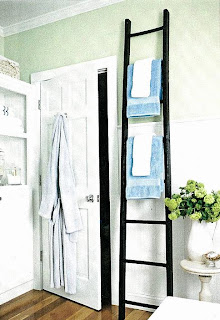
Bathroom Story in BH&G Kitchen and Bath Makeovers

Two years ago my husband and I finished our basement to include a bedroom, bathroom and common area. The photo shoots were done about a year ago and have recently appeared on news stands. The common area was featured in Better Homes and Gardens July 2009 edition and now the bathroom can be seen in BH&G's current issue of Bed and Bath Makeovers.
Kitchen and Bath Makeovers / Photographer - Bryan McCay
Stylist - Donna Talley, Regional Editor and producer for Meredith Publications

Although this is a small space, we really took our time planning every last detail - down to the vintage crystal door knobs. (not shown in photos) In fact, much to my husband's displeasure, we ended up changing every door knob and hinge in the house.

Kitchen and Bath MakeOvers / Photographer - Bryan McCay
Stylist - Donna Talley, Regional Editor and Producer for Meredith Publications

We wanted to create a bright environment as there is no natural light in this space.

We had to make several compromises because of costs including using a shower insert instead of tile and forgoing glass shower doors. To get the desired look, we used white sub-way tiles from the top of the shower insert to the ceiling, on the ceiling above the shower and on the area above the wainscotting in the front of the shower. We over calculated how much tile we needed and ended up using the left over tile as the backsplash behind the bar area. A happy mistake!

Kitchen and Bath Makeovers / Photographer - Bryan McCay
Stylist - Donna Talley, Regional Editor and Producer for Meredith Publications

Not being able to afford shower doors turned out to be a good thing as well. It gave me the opportunity to make the shower curtain which I really think makes the space special. Because this is a guest bathroom and not used on a regular basis not having doors really isn't an issue.

Kitchen and Bath Makeovers / Photograper - Bryan McCay
Styllist - Donna Talley, Regional Editor and Producer forMeredith Publications

I am very pleased with how the entire basement project turned out - bedroom, bathroom and common area. People who have visited have commented on how nice it is to stay and have asked to stay longer the next time. This makes all the planning and work worth while.

Tuesday, October 20, 2009

The Home and Store Connection

It seems to follow that stores I frequent most often are owned by people whose houses I also admire. Such is the case of Christi Tacy and her wonderful store Genevieve's Home and Garden. Christi's front porch (shown above) and bathroom (shown below) were featured last year in Better Homes and Gardens special interest publications, Do it Yourself and Bath Makeovers, respectively. Perhaps the reason I love her home and store is that both feature a wonderful mix of old and new.
It is hard to believe but this bathroom in Christi's 165 year old home was once purple with a pansy wall paper border.
Many of the items seen in these pictures are from Christi's store.
Next month, November 6th beginning at 5 pm, Genevieve's will hold it's annual open house to start off the holiday season. Christi has graciously agreed to allow me to photograph and cover the event. If you are unable to attend, look for pictures here in mid-November.

Saturday, October 10, 2009

Fabulous Fall Decorating


There has been some talk lately in the blogging world about fall and holiday decorating. Some people love it - others don't. Here are some pictures of a house that I have photographed before (Saratoga Style). I love what they have done - although over the top, I am sure for some.
Even though I, and most people, can not afford the volume of pumpkins and gourds shown here, there are some great take away ideas that we all can use. Keep your decorations natural - no plastic! Use a variety of materials - pumpkins, baskets, gourds, mums, cabbage, hay, and vines. Keep your decorating cohesive - every lamp post is done the same as are the displays lining the walkways and near the back gates. Decorate the entire house (if you can) - not just parts.
The walkway leading to the front of the house is lined on both sides.
Close up of the front walkway. Notice the jockey statue - a tradition in Saratoga Springs. Most are painted in the color of the owner's racing stable silks.
Looking inside the front gate. Look how big those pumpkins are!
Close up of one of several lamp posts surrounding the house. Notice the statue of the ballerina. I am sure she is a tribute to the New York City Ballet which is in residency here during the summer.
The front fence also is covered. If you look close you will see a horse statue in the background. This horse is one of several made by local artists which are on display through out Saratoga Springs. It is hard to tell from my picture but this is a chocolate horse with a gold foil wrapper. One of the ears has been "bitten" off.
Close up of the front fence. Love the hay hanging down and all the vines wrapping around the pumpkins and gourds.
The side gate also includes an abundance of decor.
Close up of the side gate including another jockey statue. This one is painted differently than the one at the front of the house - same colors, different silks pattern.
Finally - even the planters surrounding the house have smaller pumpkins. I hope you enjoyed seeing this beautiful house all decorated for fall. It is truly a treat to drive by and see. A big thank you to the homeowners for sharing their holiday spirit with all of us!